The challenge was to choose a package from a well-known brand and redesign it.
Why Flahavan's?
Flahavan's have focused on their heritage as an Irish brand, but through the years their packaging for their porridge oats has become outdated:
-Old-fashioned
-Cluttered
-Lacks consistency
-Forgetting audience
-Flimsy packaging

Goal
My goal for the new design is to create a more fun and fresh aesthetic for the brand. I want to communicate the brands heritage, in a clean simple design that will catch the eyes of a younger audience.
Target Audience
I want to target the majority age group in Ireland which is 25 – 44. Younger adults who are living and working in the modern world. Whilst doing this I don’t want to forget about their existing audience and motto of a wholesome breakfast for the family.

Heritage
When researching the Flahavan's I found that heritage was a large part of their brand ethos. I thought that this would be a great point to focus on and bring through in the redesign.

Dietary needs & heath benefits.
When researching the target audience I found that one thing they found important when shopping for food products, were that items that showed what dietary needs they catered to and what the health benefits were, they were more likely to buy them.
Colour & Typography
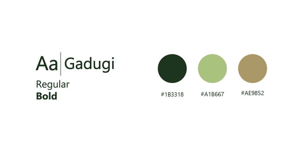
Solution
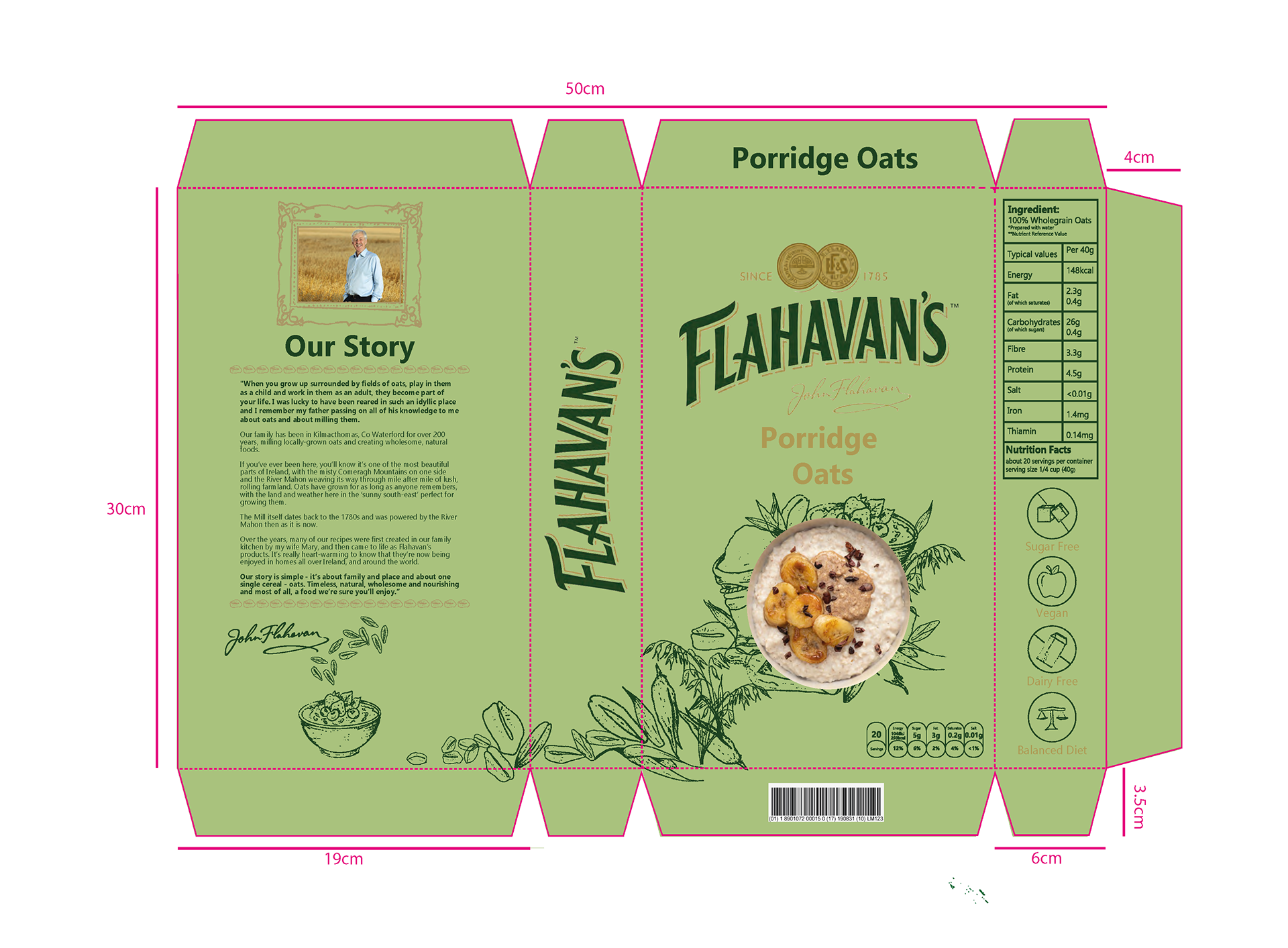
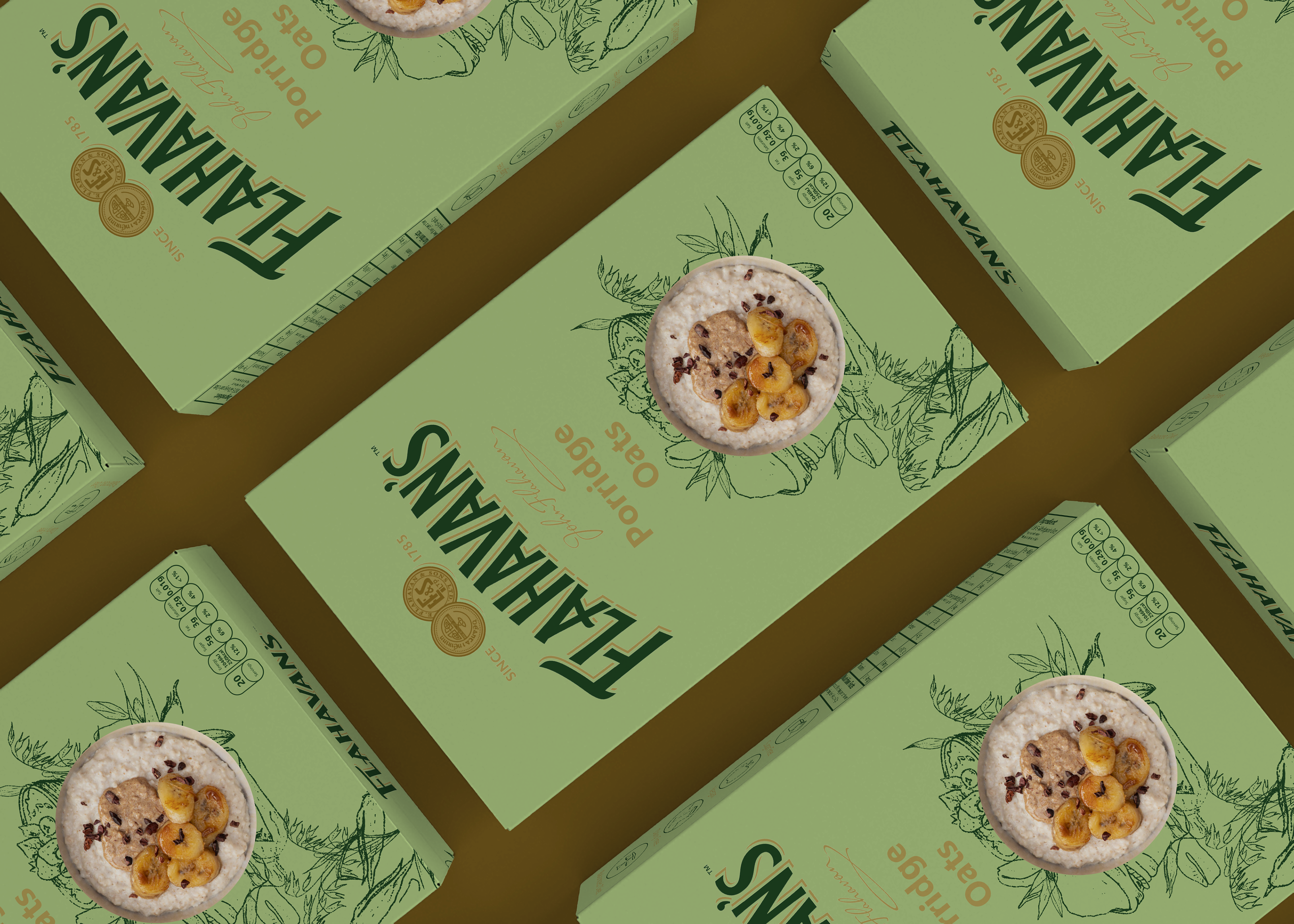
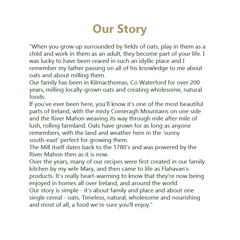
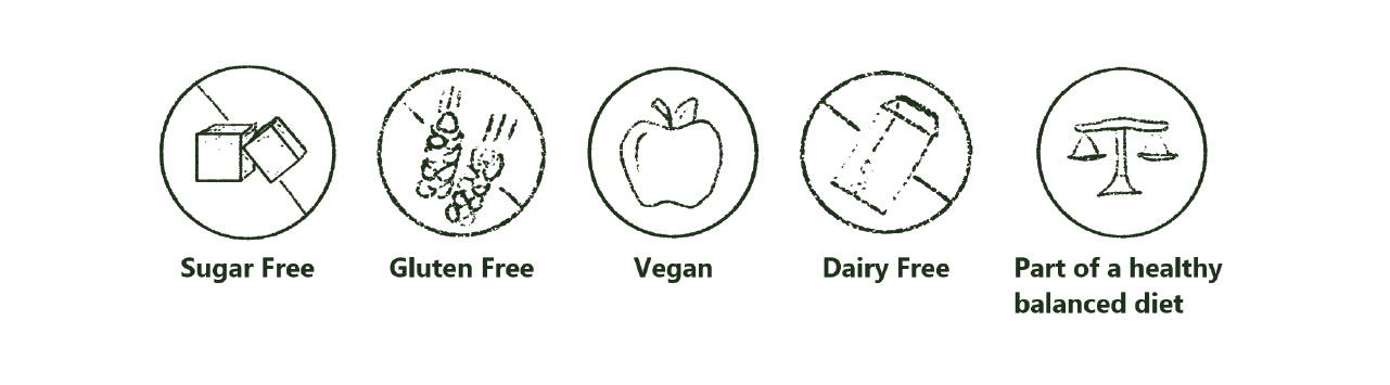
My final design for my cereal box is centered around the idea of their “story”. When researching Flahavan’s as a brand and looking at their current package I realized that the heritage of the brand was very important to them, so I wanted to bring this into my redesign. The box is laid out to mimic a book, with the brand name on the spine and essentially a blurb with the story of Flahavan’s heritage on the back of the box. The Style of graphics were created using a pencil like lines to create a handmade look, to reflect the age of the brand. And within these graphics also tells a story from grain to bowl. I also created icons that express the specific dietary specifications , so it’s easy and accessible for customers to read quickly. For my colour scheme I went with the dark green and gold from the logo, to represent Ireland where the cereal is made, and to create a clean and consistent design. Then laid these on a subtle lime green background, to add a pop of bright colour and fun to the design, so it will stand out against its competitors. For typeface used only Gadugi regular and bold. I used this sans serif in order to keep a consistent and modern design.